Hi everyone! Yesterday I attended a trend presentation, Stora Trenddagen, (Big Trend Day) here in Stockholm by Stefan Nilsson. This guy is known as the expert in trend forecasting here in Sweden, and goes by the name, Trend Stefan. I actually spent time with him during the blog tour of the Dutch Design Week last year and he’s such a great guy, so I was eager to check it out. There was one minor hitch that I faced, and that was that the presentation would be in Swedish and mine is almost, well, non-existent. I did however surprise myself by how much I understood, which I put down to Stefan being such an entertaining presenter! But don’t worry, I’m not going to lead you down the wrong track as far as this year’s trends go, I came home armed with a trend-forecasting booklet as backup!
Are you ready for Stefan’s 5 big trends for you to watch out for in 2018?
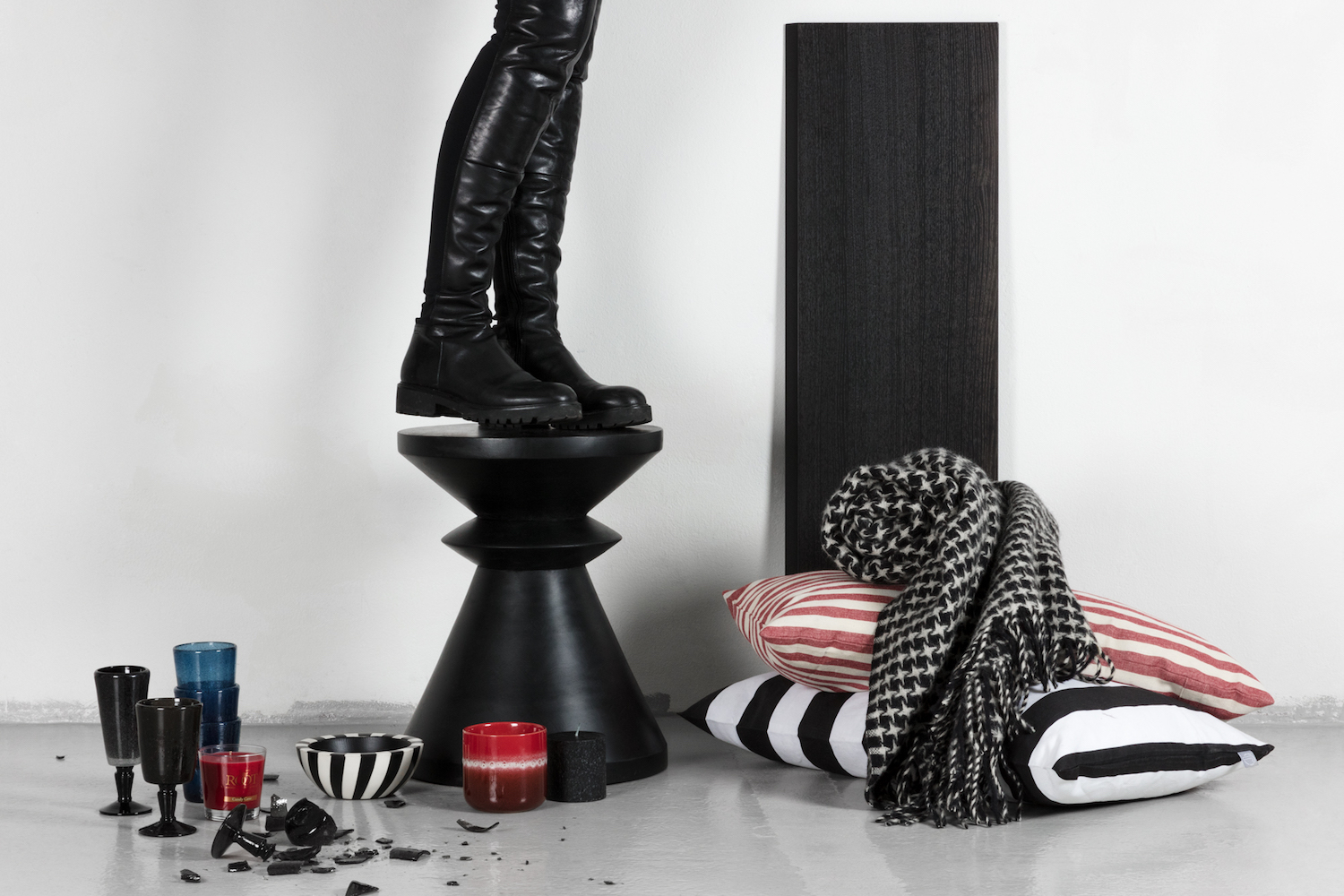
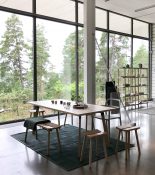
1.THE WESTWOOD EFFECT
Activism is huge! It’s about people standing up for what’s right. We’re seeing prominent themes in the community coming to our attention, like the Uber CEO resigning over the sexual harassment scandal, United Airlines had a huge backlash over their brutal handling of an overbooked passenger, and then there is #MeToo. Stefan calls activism “the new black” with slogans on t-shirts the likes of the sell out Dior t-shirt, “We Should All Be Feminists”. It’s punk and that’s why he is calling this The Westwood Effect, after the eighties icon, Vivienne Westwood, who stood up for causes.
What to look out for: Protest messages, black and white with the signal colour being red in deeper tones.
Products in image above: MEMENTO – Champagne glass in black hand- blown glass ROOT CANDELS – Red scented candle “Hollyberry” JOTEX – Black / white Grain bowl and sample ceramic bowl in black.
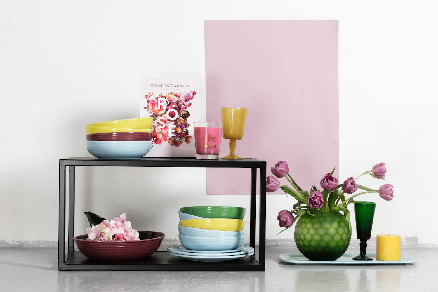
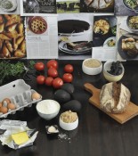
2. CMYK SMACK
Health is still in focus and we can look at colour as ways to feel good. As we are now aware, blue light from our smart devices affects the level of melantonin, which in turn affects our sleep. We will see experimental ways to use colour for health. With people beginning to tire of the “millenial pink”, the dominant colour scale is in the darker pastels like dark yellow, rasperry pink, lilac blues. There’s also a young, fun side coming. With Gucci releasing a Donald Duck capsule collection last year, we may be soon hearing about, “Minion Yellow” in interiors.
What to look out for: Anything colourful and playful in pink, yellow and blue, preferably with fluffy details. Symmetry in colourful combinations. Recycled and visually repaired details.
Find inspiration from: Bright Bazaar
Products in image above: MEMENTO – Champagne glass in green and wine glass in yellow hand-blown glass. ROOT CANDELS – Yellow beech candle light and pink scented light “Pomegranate”. FLOWER PREMIUM – Tulips KVIK – “Ferro” shelf in black steel and wood. TOUCH MEL – Bowls, tiles and plates. CASA PATRONALES – Rosévin. JOTEX – Green glassware.
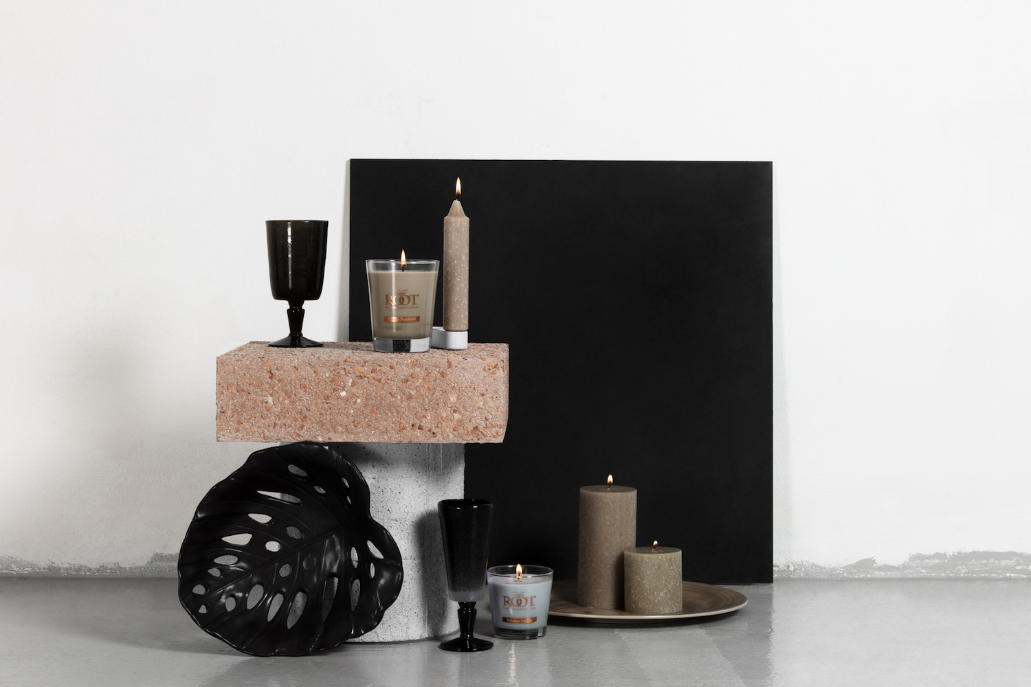
3. DUSK
This is the minimalist trend that is changing focus towards the perfect imperfect. While things will still remain pared down and carefully chosen, there will be more raw references like that big rough country kitchen table, or a distressed door. Designers will incorporate more recycled materials in their product to give that textured feel.
What to look out for: Rough textured even rustic furniture (not many – the key is restraint!), textured and/or uneven glazed ceramics, colours that are muted in dark tones of grey, beige, brown, some hints of dark denim blue and contrasts of light sandstone and clay.
Find inspiration from: Vosgesparis
Products in image above: ROOT CANDELS – Spotlight and light of beeswax and brown scented candles “Coriander Musk” and light blue scented “Seaside Driftwood”. MEMENTO – Wine glass and champagne glass in black handblown glass. TOUCH MEL – Plates in melamine. JOTEX – Monstera potato bowl in black
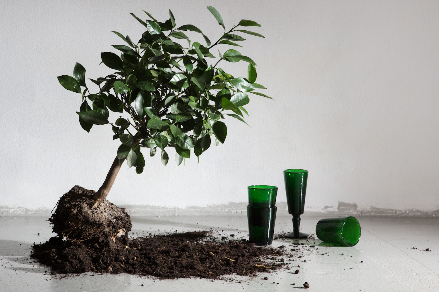
4. SATURDAY SATORI
“Satori” is the Buddhist term, “to be satisfied”. This trend stems from that mindfulness movement where our relationship with material things is less important. After “co-working”, which has really taken off, we will see more “co-living” along with sharing resources. Homes are decorated with things that help create a healthy environment for the mind or body. Plants are the obvious here because they clean the air and are peaceful, wallpaper that cleans the air could also be used along with rest areas to get away from technology and stress will also be big.
What to look out for: White metal, wood, plants, green in all colours, combined with blue to cleanse.
Find inspiration from: Urban Jungle Bloggers and Courtney Adamo
Products in image above: MEMENTO – Champagne glass and drinking glass in green handblown glass.
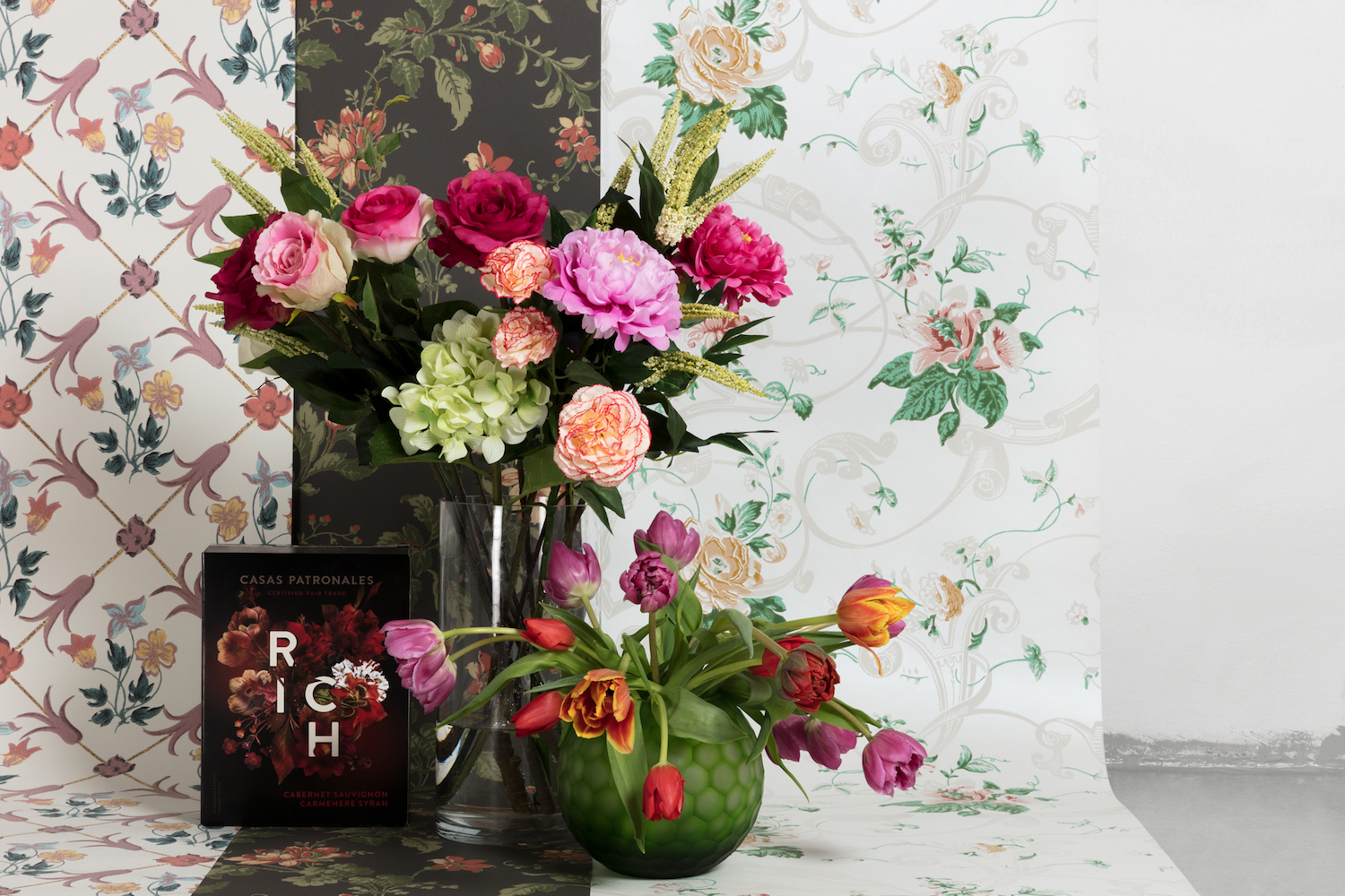
5. BAROQUE BABY
This trend is over the top and everything but minimalist! It’s a nod to our history along with exploring using new materials with old techniques or old techniques in new ways. Looking once again to fashion, Alexander McQueen made a collection inspired by 17th century embroidery. This trend is very feminine and romantic, but can be adoped by men too! We will see wallpaper with Renaissance or bold floral patterns. And if you wondered how Pantone’s colour of the year, “Ultra Violet”, fits in to the scene, it’s here.
What to look out for: Dusty rose, purple, daring wallpaper, huge flower arrangements, dried flowers (see my article for decor8 here), romantic décor, baroque paintings pared with modern furniture.
Find inspiration from: Anastasia Benko
Products in image above: BORÅSTAPETER – The collection “Anno” by Sissa Sundling. CASA PATRONALES – Red wine. JOTEX – Green glassware.
SO my big question to you is…. Where do you see your style fitting in here? For me, like always its an eclectic mix and here it would consist of a little dusk, Saturday Satori and Baroque Baby with my own style thrown in. I guess it’s all about picking bits from each trend that you like and adding touches, like that you won’t have an outdated decor in a couple of years.
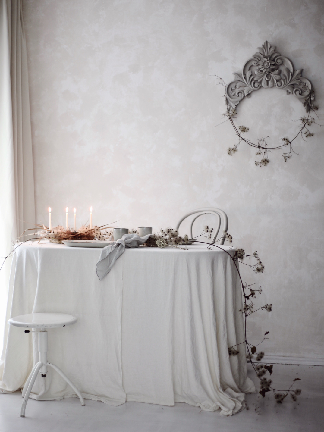
I’m finishing with an image below by my friend, the very talented stylist and photographer, Anastasia Benko. While watching the Baroque Baby part of the trend presentation, I was saying to myself – that it is sooo Anastasia. Well sure enough Stefan popped this example up to demonstrate. You must check her site out for some serious inspiration!
By the way, my latest column for decor8 is all about dried flowers which ties in beautifully with the Baroque Baby trend. Dried flowers were also unanimously declared a micro-trend by a panel of bloggers at Domotex last week, so start pressing and hanging people! Pop over to have a read.
For more future trends, don’t forget to follow me on Instagram as I visit the upcoming Stockholm Furniture & Lighting Fair. I will write a post about the key things I saw, however I will be uploading loads of stories during the week that you won’t want to miss.
See you soon!
Mel xx
P.S. I couldn’t think of any bloggers that are doing The Westwood Effect so please put in the comments if you know of any examples:)
//All above photos with permission and courtesy of Stora Trenddaggan
// Below image with permission and by Anastasia Benko

Just seen I’ve left two messages!! That will teach me to type with my glasses on!!
Hi Mel, Great to read the above trends, as I’m off to Maison Objet (Paris) on Friday, so check out my instagram for visuals. Have a great day. Lollyx
Hi Mel
I’m just about to start on SS19, so it was really interesting to read the above trends and ideas. I’m off to Maison Objet on Friday, (Paris) so will be interesting to see any cross overs. I’ll be updating my Instagram, so check out for visuals. Have a great day Mel. Lolly x
Yes it will be interesting to see what you find, I’ll definitely check in. Have fun lucky you:) x